Sunday, 30 March 2014
Saturday, 29 March 2014
Evaluation- What have you learnt about technologies from the process of constructing this product?
http://www.tiki-toki.com/timeline/entry/265611/What-I-have-learnt-during-the-production-of-my-music-magazine/#vars!date=2014-02-04_11:50:10!
Above is the timeline of learning the progression of technologies. On the timeline click More, then Find out more to be directed to my skills development. Looking overall at my timeline I can see that I have picked up and developed a wide range of skills throughout the course and the use of online facilities have become a lot more proficient and efficient. As I progressed through the course I become more accustomed to the new technologies making my work be presented in new and fluent ways. In conclusion not only have I become more design efficient but I have become a lot more aware of different ways to use technology to create and present information. Before I would've just written a simple blog post but now I would probably use software such as Prezi or Issuu.
Above is the timeline of learning the progression of technologies. On the timeline click More, then Find out more to be directed to my skills development. Looking overall at my timeline I can see that I have picked up and developed a wide range of skills throughout the course and the use of online facilities have become a lot more proficient and efficient. As I progressed through the course I become more accustomed to the new technologies making my work be presented in new and fluent ways. In conclusion not only have I become more design efficient but I have become a lot more aware of different ways to use technology to create and present information. Before I would've just written a simple blog post but now I would probably use software such as Prezi or Issuu.
Friday, 28 March 2014
Learning how to use Tiki-Toki Timeline Software
To present an overall change and progression of my work I placed it within a timeline through using Tiki-Toki timeline software. This allows me to see an overall of all my work.

Thursday, 27 March 2014
Evaluation- Who would be the audience for your media product?
Looking at my previous audience profiles I feel that I have established a good understanding of my audience but I have brought to life new audience profiles that would summarise my typical reader in a lot more detail than drawings on paper. I feel that my audience has developed along with the magazine and that although I portrayed their statistics such as going to school or liking music I felt these lacked personalities.
Below is a tumblr page for my typical female reader. I put this on a social networking site to convey her social interaction and called it 'pour me one for the road' as it is a lyric from her favourite alternative band the Arctic Monkeys.
http://pour-me-one-forthe-road.tumblr.com/
Below is a video expressing the interests of my typical male reader.
Wednesday, 26 March 2014
Learning How to use SoundCloud
To speak directly to my audience and add more emotion and interaction I have learnt and developed an understanding of how to present my work personally to someone over a computer screen.

Tuesday, 25 March 2014
Monday, 24 March 2014
Final Front Cover, Contents Page and Double Page Spread
Here I also added a Converse and H&M advert as these were the top brands from my values, attitudes and lifestyles survey, these are also the type of brands that were place on the audience profiles.
I feel that my front cover, contents page, and double page spread is complete to the standard I would want it and being attractive enough for my audience. After rectifying little details I now feel that my design is ready to be published and distributed.
Final Draft of Double Page Spread

Final Draft of Contents Page

Here I have understood and enhanced the points made on the online focus group. I have changed the Poppy Scarlet image to a similar one as I felt I needed a more relaxed and less composed snapshot to portray and attract the reader the honesty of the article. I also increased the size of the venues image so the content is more clear. I also added a couple of changes such as the writing on the pick to enhance the similarity between this and the front cover one, and removing the distracting thick black box that encased the social network links to ensure that they were less 'in your face', I also added a pull quote to the Poppy Scarlet article to heighten the attraction to this article.
Final Draft of Front Cover

After looking at my online focus group I have concluded that this design is attractive to my target market due to the lack of suggestions or complaints. Although I have heightened the opacity of the image underneath the cover lines to ensure that they are more prominent and aligned my cover lines equally to raise the professionalism. I also changed my cover line from 'Chances to Win' to just 'Win' as by including 'Chances to' this implies a negative attitude and possibility of not winning whereas the simple use of 'Win' reflects the positivity onto the viewer, thus increasing the chance of a purchase.
Sunday, 23 March 2014
Online Focus Group

I held an online focus group to improve what appeared to be my final drafts to ensure that my magazine would be attractive to my audience and if they felt that anything should be changed. The main points were:
- " I LOVE the pull quotes on the double page, and your house style flows SO nicely. I feel like everything is a little squished, but thats your style of magazine so thats fine, and the simpler dps balances that out too."
- "For the venues image why not make the content bigger and move it across in the frame?"
- (Contents Page) "The Poppy Scarlet image is a bit, goofy! Is there a similar one you could use instead? I do like the continuation of the fonts/colours however"
- (Double Page Spread) "Page number/other info at bottom of page appear too big and bold. Nice use of drop cap although text looks very italic"
- (Double Page Spread) "I like how image goes across both pages"
I will work on these points and then decide whether I like them and then rectify if there are any problems but after this I will hopefully be able to complete these knowing full well my audience will be satisfied and attracted to the product.
Saturday, 22 March 2014
Third Contents Page Draft
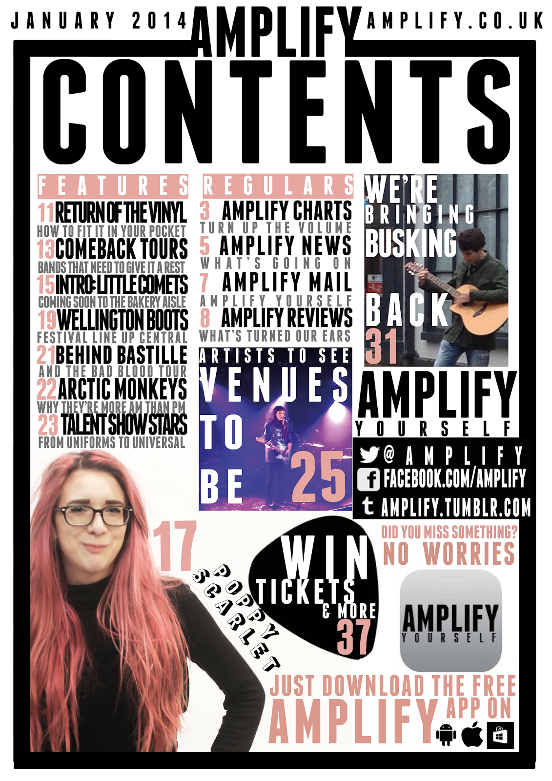
Here I have created a less busy or 'in your face' page which although looks more fluent it doesn't represent or reflect the genre I am representing. This less busy effect is created through the addition of white space. I have also added an app as due to making my Poppy Scarlet image smaller, to make it seem less out of focus, there was a considerable amount of white space left and I had already decided the articles I decided to create an app after looking at the research which suggested the majority had a smart phone and were social, this would suit my audience as I did conclude that I should use cross media convergence to keep current with my audience due to magazines becoming less and less popular as demonstrated in the lack of interest during my research. I defined the busker more by moving and enlarging the image so he takes up the majority of the image and is the subject without looking pixelated and losing the professional tone. I changed the captions to grey which I feel has also worked and made the columns of information convey themselves as less broken. The final major change to my contents page was the positioning of the social networking, as I felt that it was slightly isolated away and I think that as the research conveyed that social networking was the centre of the majority of my audiences lives this needed to reflect that, and I also placed a pick behind the 'Win' article to draw more attention and to also connect it to the similar cover line on the front cover.
Fifth Draft of Front Cover

Here I have added another cover line to ensure that I am using my space efficiently and making sure I really sell my magazine to the viewer through implying the high amount of content and conveying another story that would attract my target demographic and psychographic. I also lightened the opacity but I feel that this could be altered more to ensure the cover lines are prominent and eye catching enough to be seen. I also moved Scarlet into the middle so she is totally on the body which I think is an alteration I should keep due to the professional tone that it creates.
Friday, 21 March 2014
Second Double Page Spread Draft
For my second double page spread I added more text to ensure that my double page spread met one of the 'four needs' of entertainment and inform. I also added tags to allow my reader to interact with the magazine. Therefore allowing them to become an active audience rather than passive, also looking back at my survey one of my conclusions was that my psychographic was social and used sites such as Facebook or Twitter, so by adding '#' I automatically invite my audience to do what they do the most whilst promoting Amplify as a magazine.

Wednesday, 19 March 2014
Second Draft of Contents Page

Here is my altered contents page which now follows my new colour scheme. I changed the red to pink and changed the main image. I feel that the main image is slightly out of focus so I will probably change this to another one that's in focus but suggests a more relaxed tone which is to suggest that the article is honest. I kept the word 'win' in red to draw attention to this area and to persuade the reader to turn this page. This 'buzz' word will suggest positivity so when a viewer is looking at the contents considering to buy it they will see the only red writing which will draw their eye and possibly persuade them to purchase the magazine. I feel that I should bring 'tickets' and 'merch', I used merch as it has a more colloquial sound that will appeal to my demographic, in so the column is more defined and prominent therefore suggesting uniform and convention which Poppy Scarlet is breaking thus reinforcing her rebellious attitude. I will also need to bring in the image of the busker to also define the column here, I zoomed out of this image due to it being fairly pixelated. I will consider changing the tone of the captions to a grey as planned before as the black looks extremely compact and makes it look incredibly busy which although represents the alternative genre also reduces the fluency of the page.
Forth Draft of Front Cover

Here is my fourth draft of my front cover where I have updated the colour scheme to just pink, black and white so there is no clash anymore. I also abandoned the lines around 'unplugged' as I felt this distracted a lot away from the word itself therefore not making it as clear and concise as it could. I also enlarged the word and moved the barcode up so it can be easily read from afar and by making it the biggest part out of the cover lines it suggests that the artist is bold, big and brash so through the typography I portray the artist's traits while partly still implying that the article is 'top secret' thus almost conveying that the article is exclusive. The shade of pink isn't exactly the same as the hair colour on purpose due me not wanting the colour scheme to 'fight' as it was before therefore allowing colours not to clash but for information to still be conveyed easily. I also moved 'Poppy Scarlet' to the centre to balance out the whole front cover but I feel that I should place 'Scarlet' totally in front of my model as I feel that it would look more fluent and professional as 'Scarlet' is slightly off her body and it mostly looks like it's meant to be within her body. I could improve this by making the cover lines white so they are more prominent as I feel that they fade into the transparent images or I could raise the opacity of the images so there is more white within them therefore heightening the contrast between the cover lines and the background thus making them more defined and easier to read.
Third Draft of Front Cover

Here I have changed my front cover based on the points risen by my focus group. Here are the points I have addressed in this draft which were raised by the focus group:
- My focus group didn't understand why I had chosen a different shade of red to the house style so when I explained that I wanted to create the sense of the 'confidential' stamp to imply that the article was exclusive to Amplify they said that I should improve by actually recreating the stamp outline as well so that this point is more clear. I added this line but I feel that this distracts away from the word and increases the busy ambience on my front cover although now it is fully implied that this article is 'top secret' and for the readers eyes only.
- My focus group agreed when I asked them about the continuity of my magazine as I had followed a house style in the front cover and contents page but this was almost abandoned on the double page spread. They said to improve this that I should remove the photos with my artist with brown hair and replace with the images with pink yet keep the two transparent images to create a sense of variety within the images. When I asked whether they liked the main cover image they sad they like it and it was unique. Although through changing the main image the red now clashes with the pink meaning that I will have to decide what colour to go with. Pink has very feminine connotations but suggests dangerous and unique as this colour is often widely avoided in other media products such as the album covers or the music magazines I analysed at the start. Most of these products contained red as it appeals to most genders of their demographic as well as it represents the alternative genre as dangerous due to the connotations red carries but I feel that pink is unique and 'out there' which I feel represents the genre more accurately than red. My focus group also raised that they didn't recognise that my artist was holding an amp lead and mostly recognised it as a liquorish lace, this adapted their meaning so instead of redoing a photo shoot with my artist holding an amp lead I kept to a pain and simple mid shot of the artist looking straight into the camera which conveys attitude and individuality whilst maintaining a connection with the viewer.
- To keep within this new 'mixed' colour scheme there was a high use of red so to balance this out I coloured the skyline pink to match her hair, I really like this part but dislike the two clashing colours, this reinforces that I will need to decide and finalise a colour scheme.
- I asked my focus group to look at the masthead which they said they liked but to improve they commented to move the month of the issue and the price to somewhere that couldn't be seen as easily as they felt it distracted from the design, so I moved it next to the barcode on the right hand side so when on the newsstand this wouldn't easily be seen. They also noticed at the different font of the £ sign so I changed the whole of this font, but I still feel that this doesn't fit in so in another draft I will have to find another solution.
- When asking my focus group whether they would buy the magazine they said yes but a point was raised that I should include a competition. So I decided to give my readers a chance to win mostly tickets as within my research the majority said they wanted to go but found that something was stopping them such as money issues. I used a buzz word for this and made 'win' in the biggest font to catch the viewers eye, I placed it in a guitar pick which connects to the alternative genre and used red to in the font to draw the viewers eyes to this area. I think I should remove the 'chances to' as this raises the possibility that there is a chance the viewer won't win but if I just use the word 'win' there is more of a positive implication that there is a high chance the viewer will win and therefore purchase the magazine.
- My focus group looked at the cover lines and said they felt that overall it was too busy so I removed the top one, I do agree with my focus group and feel that it is less compacted but cover lines are extremely important in persuading the viewer to purchase so by removing one there is an implication that there is less within the magazine. I also changed my cover lines to black as my focus group commented that when I have it as the same colour as something within in the house style of that stands out on the image they felt that they would 'fight' to be seen whereas now with black there is a clear defined cover line that can be easily seen and separated from other parts of the magazine.
Saturday, 15 March 2014
Main Points from my Focus Group


Here are some photos from my focus group. All were within my demographic of 16-18 and there was a mixture of males and females but they were predominantly female which means that next time if I want more accurate results from both sides of my demographic then I will need to get a balance of males to females. In total there were eight people who attended the focus group.

Points raised about my front cover:
- Not understanding the different shade of red to the house style for 'Unplugged', after I explained that I was trying to imply a top secret or confidential stamp they understood but explained the I should make this more obvious by including the lines around it.
- Too busy cover lines which take up too much space on the left(third) but when I explained that it is meant to represent the genre they agreed yet still felt that this should be reduced.
- The cover lines colours fight with the motif on the artist's shirt which distracts away from the cover lines and makes them almost blend together.
- Enjoyed my main image with the two transparent leaning across but asked what was in her mouth therefore implicating that it isn't obvious to what my artist is biting as my group originally thought that it was a liquorish lace.
- The month and price detract from the headline and I should move it near the barcode. The £ sign is in a different font and looks unprofessional so should be changed to a totally different font.
- The focus group added that the cover lines were interesting but also felt that to persuade them more to buy the issue that there should be an opportunity to win on the cover to draw more people to become consumers.

Points raised about my contents page:
- It's very busy but then matches the front cover and follows the same style.
- Liked how all the features were matched with an image.
- Preferred the grey background to the white on the front cover and felt that these should remain the same.
- Liked how all the articles in the magazine were listed closely.
- They didn't like how the Poppy Scarlet logo had changed from having being filled with white to now outlined with white.
- The busker image was pixelated
- The titles weren't aligned right on the features.
- Couldn't recognise the CD's behind the 'Can we have some more CD's please?'

Points raised about my double page spread:
- Very different in style due to the artist now having pink hair. There is no continuity.
- Like the main caption and how they expect the last word to be an expletive but actually isn't.
- Dislikes the amount of text and feels that there could be more fitted in.
- Likes how spaced out and simple it is yet still linking back in style and organised chaos in the contents page and front cover.
- Likes the shade of pink and how it isn't girly and creates a more of a rebel independent female tone which is extremely motivational and inspiring. When I asked the males of the focus group whether they were put off with the pink they said no if it was based around that shade.
When talking about the sense of dramatic change I explained that I would go with either one or another and then asked which one to go for. The majority explained that they preferred the pink as it was more unique, individual and daring as the majority of magazines go with red as it pleases most genders, they said they expected pink to be used in women's magazines yet it works well within this genre. They also said that the pink hair was a 'statement' and portraying the individuality and 'loudness' of the artist so therefore I should use more of the images with my artist having pink hair to brown.
Friday, 14 March 2014
Double Page Spread First Draft

Learning How to Use InDesign

Thursday, 13 March 2014
Album Cover
On my double page spread I will involve my artists new album. In my research I found that this was typical of a page and almost a convention. So I quickly designed a simple album cover.

I called it 'All You Need to Know' as quite often musicians are asked very personal questions so this is the musicians response to this. The curvy sans serif font conveys a fluency but also creates a statement which can be connected to a signature which is often used to confirm information so the title is almost confirming that Scarlet is signing across her feelings. I covered her face to convey that this album is the artist and is all her emotions. I used the same font for Poppy Scarlet as the magazine to create the feel that this is her logo. I used a close up with her looking straight into the camera to create an honest tone and that this is everything she is, thus creating a personal connection between viewer/listener and artist. At some points the writing cannot be read as it blends into the image but this is the idea to convey that this is a part of the artist.
Possible Questions for my Interview
After reading artist interviews in articles I can now brainstorm possible questions I could use. Most of the interviews are based around a product and I want this feel but I would like to involve a personal tone as well.
1. How was recording your new album different from your last?
2. What's it like hearing your name over the microphone of the BRIT's?
3. What was the first song you ever learned on guitar?
4. Do you ever look back to that YouTube video with five views?
5. What was the meaning behind your new album 'All You Need to Know'?
6. What's the one thing you can't perform without?
7. What inspires your lyrics?
8. What is the most unusual thing a fan has ever done?
9. Did you grow up with music?
10. A summery of your story in five words
These are just ideas so when I get into a fluid writing style I will adjust these questions or add some to relax the tone and decrease the formal tone to appear more chatty as well as make it seem like nothing has been edited and Poppy Scarlet said all the words printed under her name.
Tuesday, 11 March 2014
Photo Selection


Here is my contact sheets where I have crossed off the images I won't be using. The majority are due to her looking away from the camera or moving but some images I tried and experimented but disliked the outcome. For example I tried having someone act as a 'stylist' to create the personal tone through 'behind the scenes' shots but I didn't feel this worked due to the type of shot and props. If I had prepared more then I would've known to do an over the shoulder shot of a stylist facing away doing mascara and the artist looking up with her mouth slightly open (which is how mascara is represented when applying). I would also use a gold reflector being held near the artist's face to create a warm ambience that would usually be created from normal lights in a studio. Other shots of my artist sitting down that were rejected were my attempts at capturing a natural pose that would be behind the scenes but these didn't have the desired effect and simply look like the artist is looking away but not having any interaction or conveying a sense of enjoyment. I then progressed and asked her to bring her legs in to create a more defined shape against the white screen, this contrast will emphasise the artist and therefore heighten the impact. I then transferred to a more relaxed pose of sitting cross legged, I tried this more relaxed pose to create a more open and honest ambience but I feel that these didn't work as well as the 'N' shaped pose as there was a more of a defined shape which had a higher impact and a more professional tone. I then proceeded to do medium shots which I really liked as a connection could easily me made between the artist and the reader. I also liked the shot of my artist laughing and this was a natural shot that I might incorporate into my magazine as it conveys a softer side of my artist's personality which isn't often seen in magazines as usually there is only one personality shown but this extends my artist's traits and creates a feel that my audience is closer to the artist.
Monday, 10 March 2014
Second Photo Shoot Contact Sheet
As I planned I knew that I would have to perform a second photo shoot so therefore I took the same timing structure, location and lighting from before but this time I wouldn't use props to create a sense of variety. I asked my model to stick to conventions by wearing the typical artist attire of all black but to not wear a plain t-shirt and trousers as this is very conventional, instead I asked her to wear black dungarees with black tights and the same black creepers to ensure there was a link between the two but this isn't vital as her shoes cannot be seen in the first images. I also had to change the poses, for the double page spread I wanted to convey a very relaxed and open tone to create the honest ambience that I wanted my reader to experience so I asked my artist to sit down on the floor to appear toned down and to create an equal between the artist and reader. So I experimented with poses where her legs were crossed and holding herself up with her arms, although I wanted to avoid conveying my artist as too relaxed, such as lying down on her side, due to this contradicting the persona of the front cover image thus removing the tone of honesty away from my magazine. When I met my artist she had dyed her hair pink, I had not allowed or expected this change to happen so I went ahead with the planned shoot, although I did add some medium shots just in case that the variety was too much, but this might mean having to reshoot for different front cover and contents image if my focus group pick up on such a wide variety. Another option is that I could try and recreate the brown hair on Photoshop or vice versa. Another person was present at the shoot and I experimented with the fact of someone 'styling' the artist to give another sense of honesty through the 'behind the scenes' images but I felt that these didn't work so I feel I will probably leave it out. I also had to place weights on the white screen to prevent it from rolling back which can sometimes be visible but I will crop them out of the final piece.


Thursday, 6 March 2014
Draft of Contents Page

Here is my draft of my contents page. I have kept to the house style with colour and font to form a sense of continuity between the front cover and contents page. I paced Poppy Scarlet who is my featured artist as the biggest part of the page as this is the leading article and one that the audience will probably have most interest in. I also decided to feature a quote from the article to entice the consumer to read this article. I used three different fonts within this pull quote. The main one being the font that is part of the house style but then I used a serif font in italics for 'Right' as these combined convey a style that has traditional connotations which matches the meaning of the word, then for 'Wrong' I used an eroded and damaged sans serif font to portray the damage that is associated with the word. I decided to use a different photo to one from the front cover to create a sense of variety throughout. I placed her in the corner to allow articles to be able to be placed around efficiently. I then added three more images to balance the text and images to convey that there is more, but to also draw the viewers attention to these articles. The two images of the live concert and the busker I kept in a square as I feel that the image of Poppy Scarlet isn't very linear so to balance this out I would keep the images square, but also buy keeping them this shape it fills up empty space which is to convey the busy and chaotic side of the alternative genre. I also felt that by restricting the other parts of the contents page to their columns it implies the free and rebelled spirit of my artist that she is breaking the columns. I kept the use of red very minimal and used it mainly for the folios so these would stand out and assist the navigation of the magazine. The navigation of the magazine is important as it can affect the attitude towards it, if the consumer struggles then this will create a negative attitude which could push them to not buy the magazine again. I also changed the colours of type for the featured articles to highlight them and to make them more striking to the reader so they would look at these articles. I compact every other article into one column to make space for the images but I feel that these are too black and there is no way to differentiate between title and caption. I will change the colour of the caption to separate these, but I will keep to the house style. I won't use red as it will distract from the folios and make it harder to navigate, I will try white and experiment but I really don't want to distract from more important parts of the magazine. I placed the social interaction parts in the bottom right corner to allow them to stand out although I find that these are out of the way and could not be seen I really like how they fit in the bottom right corner and merge into the border so I will experiment with moving this into a more prominent box where they are more likely to be seen. I find the picture for the article 'Can we have some more CD's please' isn't very obvious or clear to what it is so could cause some confusion to the viewer. I will take a clearer image that will be more obvious and see whether that will bring any more improvements. I feel that this image doesn't conform to the house style of the linear squares although it is a straight lined shape, so if I take another image I will see whether I can stick to the square shape.
Subscribe to:
Posts (Atom)