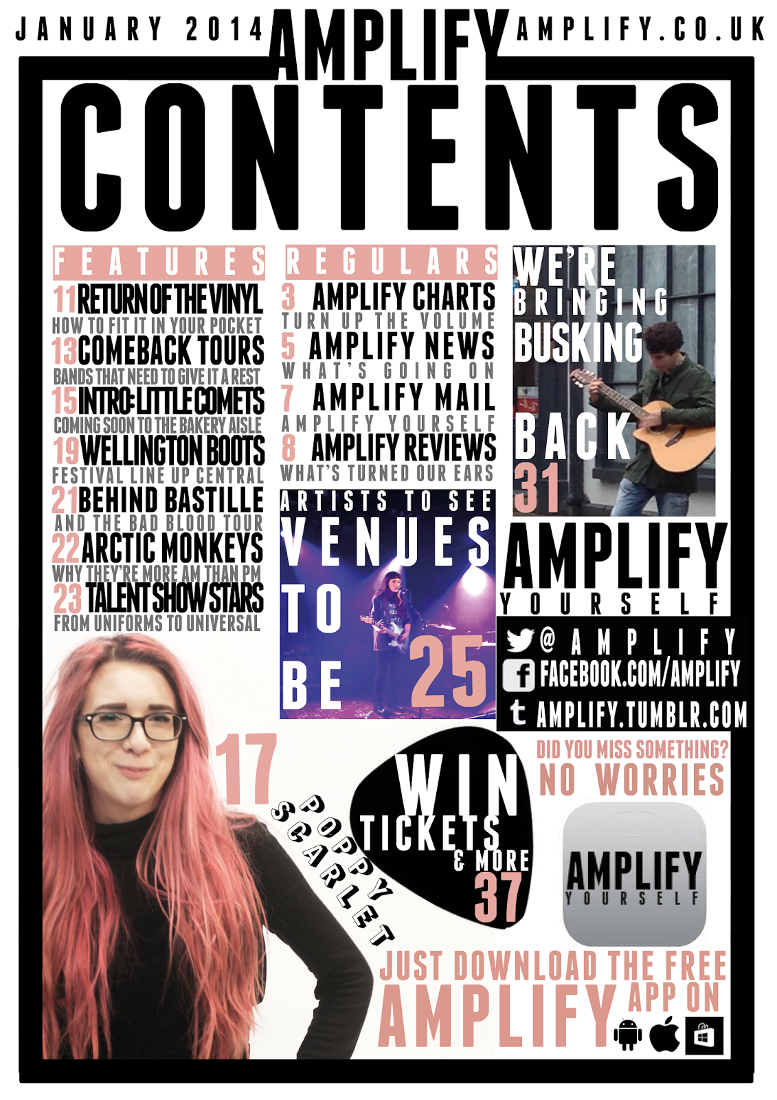
Here I have created a less busy or 'in your face' page which although looks more fluent it doesn't represent or reflect the genre I am representing. This less busy effect is created through the addition of white space. I have also added an app as due to making my Poppy Scarlet image smaller, to make it seem less out of focus, there was a considerable amount of white space left and I had already decided the articles I decided to create an app after looking at the research which suggested the majority had a smart phone and were social, this would suit my audience as I did conclude that I should use cross media convergence to keep current with my audience due to magazines becoming less and less popular as demonstrated in the lack of interest during my research. I defined the busker more by moving and enlarging the image so he takes up the majority of the image and is the subject without looking pixelated and losing the professional tone. I changed the captions to grey which I feel has also worked and made the columns of information convey themselves as less broken. The final major change to my contents page was the positioning of the social networking, as I felt that it was slightly isolated away and I think that as the research conveyed that social networking was the centre of the majority of my audiences lives this needed to reflect that, and I also placed a pick behind the 'Win' article to draw more attention and to also connect it to the similar cover line on the front cover.
No comments:
Post a Comment