Sunday, 30 March 2014

Saturday, 29 March 2014
Evaluation- What have you learnt about technologies from the process of constructing this product?
http://www.tiki-toki.com/timeline/entry/265611/What-I-have-learnt-during-the-production-of-my-music-magazine/#vars!date=2014-02-04_11:50:10!
Above is the timeline of learning the progression of technologies. On the timeline click More, then Find out more to be directed to my skills development. Looking overall at my timeline I can see that I have picked up and developed a wide range of skills throughout the course and the use of online facilities have become a lot more proficient and efficient. As I progressed through the course I become more accustomed to the new technologies making my work be presented in new and fluent ways. In conclusion not only have I become more design efficient but I have become a lot more aware of different ways to use technology to create and present information. Before I would've just written a simple blog post but now I would probably use software such as Prezi or Issuu.
Above is the timeline of learning the progression of technologies. On the timeline click More, then Find out more to be directed to my skills development. Looking overall at my timeline I can see that I have picked up and developed a wide range of skills throughout the course and the use of online facilities have become a lot more proficient and efficient. As I progressed through the course I become more accustomed to the new technologies making my work be presented in new and fluent ways. In conclusion not only have I become more design efficient but I have become a lot more aware of different ways to use technology to create and present information. Before I would've just written a simple blog post but now I would probably use software such as Prezi or Issuu.
Friday, 28 March 2014
Learning how to use Tiki-Toki Timeline Software
To present an overall change and progression of my work I placed it within a timeline through using Tiki-Toki timeline software. This allows me to see an overall of all my work.

Thursday, 27 March 2014
Evaluation- Who would be the audience for your media product?
Looking at my previous audience profiles I feel that I have established a good understanding of my audience but I have brought to life new audience profiles that would summarise my typical reader in a lot more detail than drawings on paper. I feel that my audience has developed along with the magazine and that although I portrayed their statistics such as going to school or liking music I felt these lacked personalities.
Below is a tumblr page for my typical female reader. I put this on a social networking site to convey her social interaction and called it 'pour me one for the road' as it is a lyric from her favourite alternative band the Arctic Monkeys.
http://pour-me-one-forthe-road.tumblr.com/
Below is a video expressing the interests of my typical male reader.
Below is a tumblr page for my typical female reader. I put this on a social networking site to convey her social interaction and called it 'pour me one for the road' as it is a lyric from her favourite alternative band the Arctic Monkeys.
http://pour-me-one-forthe-road.tumblr.com/
Below is a video expressing the interests of my typical male reader.
Wednesday, 26 March 2014
Learning How to use SoundCloud
To speak directly to my audience and add more emotion and interaction I have learnt and developed an understanding of how to present my work personally to someone over a computer screen.

Tuesday, 25 March 2014
Monday, 24 March 2014
Final Front Cover, Contents Page and Double Page Spread
Here I also added a Converse and H&M advert as these were the top brands from my values, attitudes and lifestyles survey, these are also the type of brands that were place on the audience profiles.
I feel that my front cover, contents page, and double page spread is complete to the standard I would want it and being attractive enough for my audience. After rectifying little details I now feel that my design is ready to be published and distributed.
Final Draft of Double Page Spread

Final Draft of Contents Page

Here I have understood and enhanced the points made on the online focus group. I have changed the Poppy Scarlet image to a similar one as I felt I needed a more relaxed and less composed snapshot to portray and attract the reader the honesty of the article. I also increased the size of the venues image so the content is more clear. I also added a couple of changes such as the writing on the pick to enhance the similarity between this and the front cover one, and removing the distracting thick black box that encased the social network links to ensure that they were less 'in your face', I also added a pull quote to the Poppy Scarlet article to heighten the attraction to this article.
Final Draft of Front Cover

After looking at my online focus group I have concluded that this design is attractive to my target market due to the lack of suggestions or complaints. Although I have heightened the opacity of the image underneath the cover lines to ensure that they are more prominent and aligned my cover lines equally to raise the professionalism. I also changed my cover line from 'Chances to Win' to just 'Win' as by including 'Chances to' this implies a negative attitude and possibility of not winning whereas the simple use of 'Win' reflects the positivity onto the viewer, thus increasing the chance of a purchase.
Sunday, 23 March 2014
Online Focus Group

I held an online focus group to improve what appeared to be my final drafts to ensure that my magazine would be attractive to my audience and if they felt that anything should be changed. The main points were:
- " I LOVE the pull quotes on the double page, and your house style flows SO nicely. I feel like everything is a little squished, but thats your style of magazine so thats fine, and the simpler dps balances that out too."
- "For the venues image why not make the content bigger and move it across in the frame?"
- (Contents Page) "The Poppy Scarlet image is a bit, goofy! Is there a similar one you could use instead? I do like the continuation of the fonts/colours however"
- (Double Page Spread) "Page number/other info at bottom of page appear too big and bold. Nice use of drop cap although text looks very italic"
- (Double Page Spread) "I like how image goes across both pages"
I will work on these points and then decide whether I like them and then rectify if there are any problems but after this I will hopefully be able to complete these knowing full well my audience will be satisfied and attracted to the product.
Saturday, 22 March 2014
Third Contents Page Draft
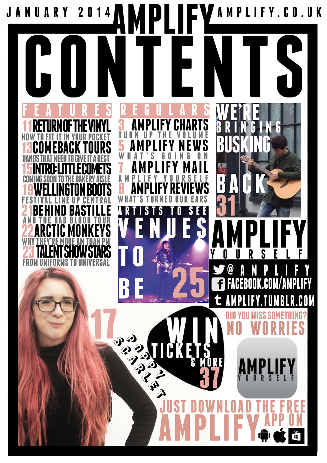
Here I have created a less busy or 'in your face' page which although looks more fluent it doesn't represent or reflect the genre I am representing. This less busy effect is created through the addition of white space. I have also added an app as due to making my Poppy Scarlet image smaller, to make it seem less out of focus, there was a considerable amount of white space left and I had already decided the articles I decided to create an app after looking at the research which suggested the majority had a smart phone and were social, this would suit my audience as I did conclude that I should use cross media convergence to keep current with my audience due to magazines becoming less and less popular as demonstrated in the lack of interest during my research. I defined the busker more by moving and enlarging the image so he takes up the majority of the image and is the subject without looking pixelated and losing the professional tone. I changed the captions to grey which I feel has also worked and made the columns of information convey themselves as less broken. The final major change to my contents page was the positioning of the social networking, as I felt that it was slightly isolated away and I think that as the research conveyed that social networking was the centre of the majority of my audiences lives this needed to reflect that, and I also placed a pick behind the 'Win' article to draw more attention and to also connect it to the similar cover line on the front cover.
Fifth Draft of Front Cover

Here I have added another cover line to ensure that I am using my space efficiently and making sure I really sell my magazine to the viewer through implying the high amount of content and conveying another story that would attract my target demographic and psychographic. I also lightened the opacity but I feel that this could be altered more to ensure the cover lines are prominent and eye catching enough to be seen. I also moved Scarlet into the middle so she is totally on the body which I think is an alteration I should keep due to the professional tone that it creates.
Friday, 21 March 2014
Second Double Page Spread Draft
For my second double page spread I added more text to ensure that my double page spread met one of the 'four needs' of entertainment and inform. I also added tags to allow my reader to interact with the magazine. Therefore allowing them to become an active audience rather than passive, also looking back at my survey one of my conclusions was that my psychographic was social and used sites such as Facebook or Twitter, so by adding '#' I automatically invite my audience to do what they do the most whilst promoting Amplify as a magazine.

Subscribe to:
Posts (Atom)