Sunday, 23 March 2014

Online Focus Group

I held an online focus group to improve what appeared to be my final drafts to ensure that my magazine would be attractive to my audience and if they felt that anything should be changed. The main points were:

  • I LOVE the pull quotes on the double page, and your house style flows SO nicely. I feel like everything is a little squished, but thats your style of magazine so thats fine, and the simpler dps balances that out too."
  • "For the venues image why not make the content bigger and move it across in the frame?"
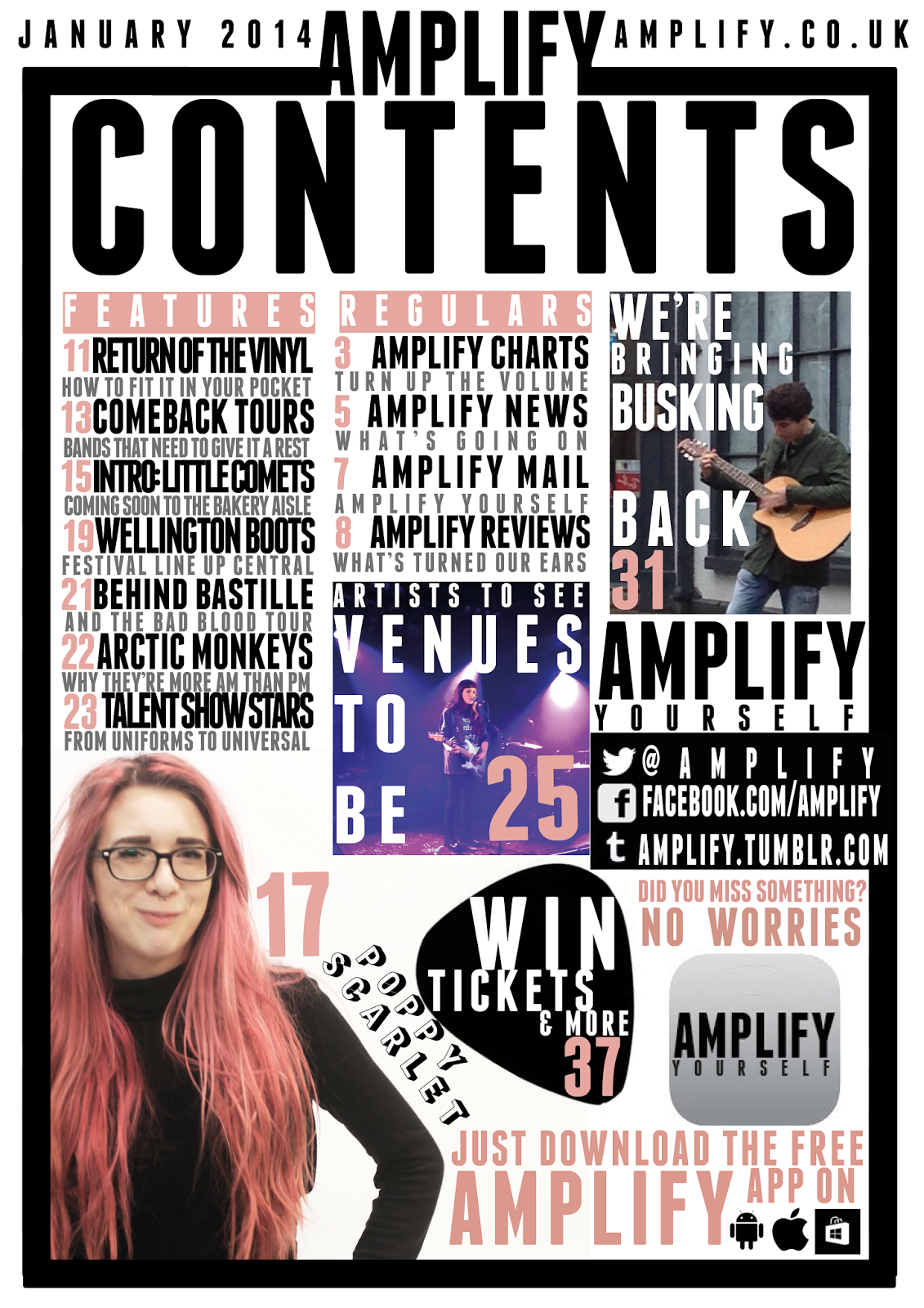
  • (Contents Page) "The Poppy Scarlet image is a bit, goofy! Is there a similar one you could use instead? I do like the continuation of the fonts/colours however"
  • (Double Page Spread) "Page number/other info at bottom of page appear too big and bold. Nice use of drop cap although text looks very italic"
  •  (Double Page Spread) "I like how image goes across both pages" 

I will work on these points and then decide whether I like them and then rectify if there are any problems but after this I will hopefully be able to complete these knowing full well my audience will be satisfied and attracted to the product.

Saturday, 22 March 2014

Third Contents Page Draft

Here I have created a less busy or 'in your face' page which although looks more fluent it doesn't represent or reflect the genre I am representing. This less busy effect is created through the addition of white space. I have also added an app as due to making my Poppy Scarlet image smaller, to make it seem less out of focus, there was a considerable amount of white space left and I had already decided the articles I decided to create an app after looking at the research which suggested the majority had a smart phone and were social, this would suit my audience as I did conclude that I should use cross media convergence to keep current with my audience due to magazines becoming less and less popular as demonstrated in the lack of interest during my research. I defined the busker more by moving and enlarging the image so he takes up the majority of the image and is the subject without looking pixelated and losing the professional tone. I changed the captions to grey which I feel has also worked and made the columns of information convey themselves as less broken. The final major change to my contents page was the positioning of the social networking, as I felt that it was slightly isolated away and I think that as the research conveyed that social networking was the centre of the majority of my audiences lives this needed to reflect that, and I also placed a pick behind the 'Win' article to draw more attention and to also connect it to the similar cover line on the front cover.

Fifth Draft of Front Cover

Here I have added another cover line to ensure that I am using my space efficiently and making sure I really sell my magazine to the viewer through implying the high amount of content and conveying another story that would attract my target demographic and psychographic. I also lightened the opacity but I feel that this could be altered more to ensure the cover lines are prominent and eye catching enough to be seen. I also moved Scarlet into the middle so she is totally on the body which I think is an alteration I should keep due to the professional tone that it creates.

Friday, 21 March 2014

Second Double Page Spread Draft

For my second double page spread I added more text to ensure that my double page spread met one of the 'four needs' of entertainment and inform. I also added tags to allow my reader to interact with the magazine. Therefore allowing them to become an active audience rather than passive, also looking back at my survey one of my conclusions was that my psychographic was social and used sites such as Facebook or Twitter, so by adding '#' I automatically invite my audience to do what they do the most whilst promoting Amplify as a magazine.
 

Wednesday, 19 March 2014

Second Draft of Contents Page


Here is my altered contents page which now follows my new colour scheme. I changed the red to pink and changed the main image. I feel that the main image is slightly out of focus so I will probably change this to another one that's in focus but suggests a more relaxed tone which is to suggest that the article is honest. I kept the word 'win' in red to draw attention to this area and to persuade the reader to turn this page. This 'buzz' word will suggest positivity so when a viewer is looking at the contents considering to buy it they will see the only red writing which will draw their eye and possibly persuade them to purchase the magazine. I feel that I should bring 'tickets' and 'merch', I used merch as it has a more colloquial sound that will appeal to my demographic, in so the column is more defined and prominent therefore suggesting uniform and convention which Poppy Scarlet is breaking thus reinforcing her rebellious attitude. I will also need to bring in the image of the busker to also define the column here, I zoomed out of this image due to it being fairly pixelated. I will consider changing the tone of the captions to a grey as planned before as  the black looks extremely compact and makes it look incredibly busy which although represents the alternative genre also reduces the fluency of the page.

Forth Draft of Front Cover

Here is my fourth draft of my front cover where I have updated the colour scheme to just pink, black and white so there is no clash anymore. I also abandoned the lines around 'unplugged' as I felt this distracted a lot away from the word itself therefore not making it as clear and concise as it could. I also enlarged the word and moved the barcode up so it can be easily read from afar and by making it the biggest part out of the cover lines it suggests that the artist is bold, big and brash so through the typography I portray the artist's traits while partly still implying that the article is 'top secret' thus almost conveying that the article is exclusive. The shade of pink isn't exactly the same as the hair colour on purpose due me not wanting the colour scheme to 'fight' as it was before therefore allowing colours not to clash but for information to still be conveyed easily. I also moved 'Poppy Scarlet' to the centre to balance out the whole front cover but I feel that I should place 'Scarlet' totally in front of my model as I feel that it would look more fluent and professional as 'Scarlet' is slightly off her body and it mostly looks like it's meant to be within her body. I could improve this by making the cover lines white so they are more prominent as I feel that they fade into the transparent images or I could raise the opacity of the images so there is more white within them therefore heightening the contrast between the cover lines and the background thus making them more defined and easier to read.

Third Draft of Front Cover

Here I have changed my front cover based on the points risen by my focus group. Here are the points I have addressed in this draft which were raised by the focus group:
 
  • My focus group didn't understand why I had chosen a different shade of red to the house style so when I explained that I wanted to create the sense of the 'confidential' stamp to imply that the article was exclusive to Amplify they said that I should improve by actually recreating the stamp outline as well so that this point is more clear. I added this line but I feel that this distracts away from the word and increases the busy ambience on my front cover although now it is fully implied that this article is 'top secret' and for the readers eyes only.
  • My focus group agreed when I asked them about the continuity of my magazine as I had followed a house style in the front cover and contents page but this was almost abandoned on the double page spread. They said to improve this that I should remove the photos with my artist with brown hair and replace with the images with pink yet keep the two transparent images to create a sense of variety within the images. When I asked whether they liked the main cover image they sad they like it and it was unique. Although through changing the main image the red now clashes with the pink meaning that I will have to decide what colour to go with. Pink has very feminine connotations but suggests dangerous and unique as this colour is often widely avoided in other media products such as the album covers or the music magazines I analysed at the start. Most of these products contained red as it appeals to most genders of their demographic as well as it represents the alternative genre as dangerous due to the connotations red carries but I feel that pink is unique and 'out there' which I feel represents the genre more accurately than red. My focus group also raised that they didn't recognise that my artist was holding an amp lead and mostly recognised it as a liquorish lace, this adapted their meaning so instead of redoing a photo shoot with my artist holding an amp lead I kept to a pain and simple mid shot of the artist looking straight into the camera which conveys attitude and individuality whilst maintaining a connection with the viewer.
  • To keep within this new 'mixed' colour scheme there was a high use of red so to balance this out I coloured the skyline pink to match her hair, I really like this part but dislike the two clashing colours, this reinforces that I will need to decide and finalise a colour scheme.
  • I asked my focus group to look at the masthead which they said they liked but to improve they commented to move the month of the issue and the price to somewhere that couldn't be seen as easily as they felt it distracted from the design, so I moved it next to the barcode on the right hand side so when on the newsstand this wouldn't easily be seen. They also noticed at the different font of the £ sign so I changed the whole of this font, but I still feel that this doesn't fit in so in another draft I will have to find another solution.
  • When asking my focus group whether they would buy the magazine they said yes but a point was raised that I should include a competition. So I decided to give my readers a chance to win mostly tickets as within my research the majority said they wanted to go but found that something was stopping them such as money issues. I used a buzz word for this and made 'win' in the biggest font to catch the viewers eye, I placed it in a guitar pick which connects to the alternative genre and used red to in the font to draw the viewers eyes to this area. I think I should remove the 'chances to' as this raises the possibility that there is a chance the viewer won't win but if I just use the word 'win' there is more of a positive implication that there is a high chance the viewer will win and therefore purchase the magazine.
  • My focus group looked at the cover lines and said they felt that overall it was too busy so I removed the top one, I do agree with my focus group and feel that it is less compacted but cover lines are extremely important in persuading the viewer to purchase so by removing one there is an implication that there is less within the magazine. I also changed my cover lines to black as my focus group commented that when I have it as the same colour as something within in the house style of that stands out on the image they felt that they would 'fight' to be seen whereas now with black there is a clear defined cover line that can be easily seen and separated from other parts of the magazine.